WK05. – Similar projects
After having done my historical research and understanding how emergent technologies have been used in coastal and marine surveys during recent years, I went on to find relevant projects that took the form that I want to implement: an app that aids beach cleaning surveys.
I found different apps that provided interesting features that aid researchers and people (usually volunteers) to enter the necessary data to start a beach survey. This takes away from the equation the need to use the traditional ‘data cards’ and it allows for a faster and more convenient solution to collect and analyse data.
Analyisis of similar apps
So, it seems that the idea of an app that improves the process of collecting data has already been done. My mission then, was to find if there was room for my solution to come as an innovation that improves upon the present online solution. To do so, I took 5 different apps with different capabilities and used them. While using them I identified:
- Their operating system availability.
- Description of the app
- Key Features
- App visuals
I created a table for each app, and extracted all these key information to be able to start thinking of which features my app would benefit from.
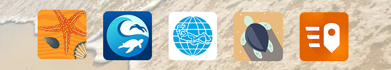
Clean Swell app analysis
Padi Aware app analysis
Marine Debris Tracker app analysis
Quick Capture app analysis
Beachwatch app analysis
Being the User
I documented the use of the Clean Swell app with a video. This was an exercise that helped me to take the role of the user, and understand first-hand some of the pain points of the app ux journey. To do so, I went out to the streets of my neighborhood and collected litter information with the app.
After using this app for the first time, I noticed straightaway that manually registering piece by piece, even with buttons, was time-consuming. It was even frustrating not to be able to find the right category for the object I was seeing. This app, in particular, didn’t have a search bar, so I couldn’t find objects quickly and register them properly. In some other cases, I was even making assumptions about objects for which I wasn’t sure which category they would better fit. The app also offered the option to add images, but this didn’t work at all. Finally, I think a positive thing about the app was the metrics it was using, such as total count, time, and estimated weight, as well as being able to save this data on the app, which meant I could move to other apps without losing my session.
I did the same exercise with the Marine Debris Tracker. I went out to register litter in my neighborhood. This app has a similar system for registering litter, i.e., buttons with images to add an item. However, this app did have a search bar, which meant I could type the object I was seeing, and therefore find the corresponding button quicker. This made a big difference. The app also showed me the places I had been, and where exactly I had registered the presence of litter, which I found very compelling as a feature.
User Journey analysis
I want to highlight that all of these processes (extracting features from the apps, testing them, and using them) were happening at the same time. In this section, I wanted to show the process I went through with the user journey of each app. To be able to visualize the different steps that the apps offered me, I took screenshots of the steps that were key during the journey. I then organized these screenshots and printed them out to make annotations.
This exercise has enhanced my comprehension of the various stages involved in app development, with the annotations serving as a procedural framework for my personal understanding. For example, it helped me to consider the onboarding process and how it is done, as well as what happens if an user doesn’t log in, and how data is being handled, etc. Access to the annotations is available via the following link. Please enter and open it in full-screen mode for better visibility.
Feature Analysis Comparison Chart
After analysing each app and using it, I summarized the findings in a Feature Analysis Comparison Chart. This chart shows common features that I was able to identify among the apps and also helps me to compare the different elements/ features that each app offers. This chart will be used to inform my selection of features.
The making of this chart allowed me to solve some of the questions that I had about the necessity of certain features within my app. These features were:
- User login and user accounts: I was considering not having user accounts to minimize the friction of bringing in new users. However, having user accounts has many benefits to the development of a compelling product, especially when it comes to the user tracking their progress, and being rewarded for their efforts.
- My main user: I had doubts about whether the app should be focused on researchers only, but the importance of citizen-powered projects is such, that the development of apps that improve the knowledge of volunteers is key.
- Recoding photos and location: these two features are key. These features are being implemented in different ways, yet they are still present within the apps’ capabilities.
Supervision Feedback
During this supervision, we have focused on understanding what has been done up until now, how it can be improved, and what needs to be done during the coming weeks (under my own commitment to keep working on my project).
Outstanding actions:
- Define the values underpinning my work
- Define Beneficiaries
- UX research has been started, but it needs to be supported with research. For example, if I choose to use a feature I have to justify why that feature might be the appropriate one.
After the break I need to have:
- The Graduation Project presentation. I need to present on Tuesday the 9th of April.
- According to my own timeline, I need to start and advance in the coding of the interface.
- Stella has proposed some experimentation with the tool itself.